Case Study: Supporting BroProUK’s Mission Through Practical Design
BroProUK came to me with a strong purpose: raising awareness around men’s mental health.
They were already doing meaningful work in their community but like many grassroots organisations, their visual presence hadn’t yet caught up with their impact.
This project wasn’t about overhauling everything. It was about making what they already had work better, and giving them the tools to keep going independently.
The Challenge
BroProUK had an existing logo and growing presence, but there were a few key limitations:
- The logo format didn’t translate well to digital use
- Brand assets were limited and inconsistent
- Marketing materials needed to be created quickly and regularly
- They needed the ability to edit and reuse designs themselves
This wasn’t a one-off design job. It was ongoing support.
The Strategy
Rather than locking them into relying on a designer for every update, I focused on two things:
1. Make the brand more usable
2. Make the team more self-sufficient
That meant improving what existed, while also giving them tools they could actually use day-to-day.
The Process
1. Reworking the Logo for Digital
The original logo was too wide, which made it difficult to use across:
- Social media profiles
- Banners
- Mobile-friendly formats
I adapted the logo into a more flexible format that retained its identity, but worked properly across digital platforms.
A small change, but one that removed constant friction.
2. Building a Set of Brand Assets
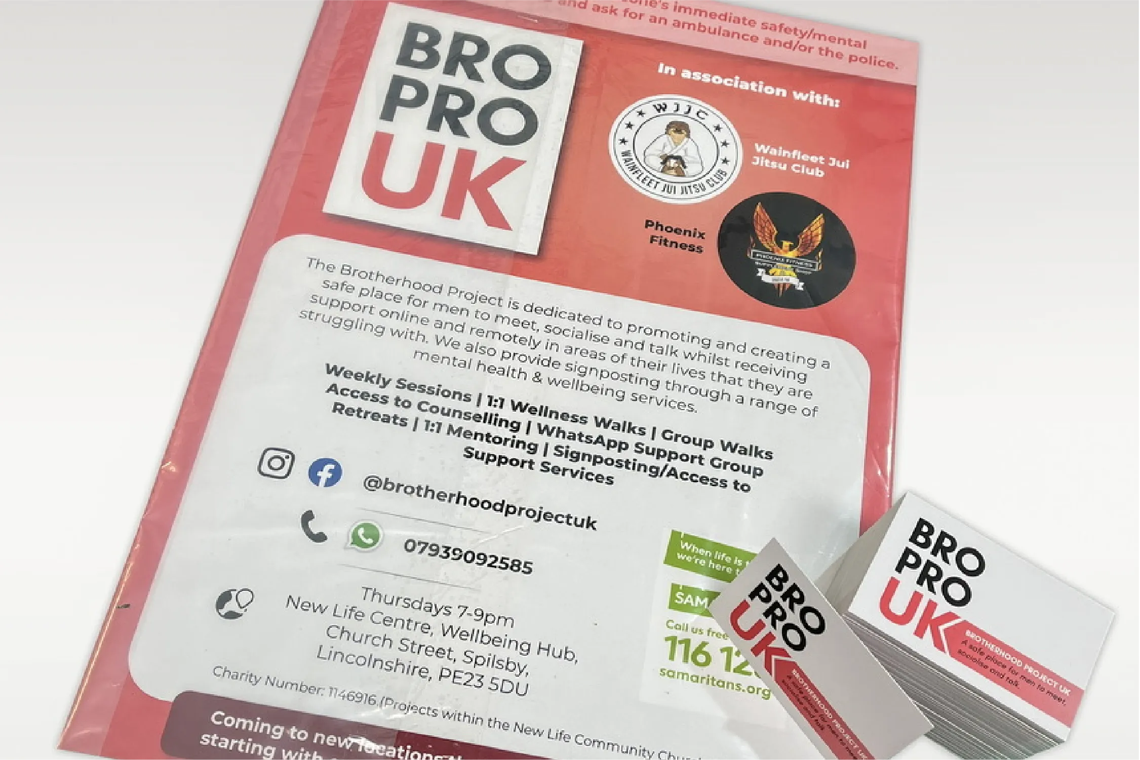
To support their awareness efforts, I designed a range of materials:
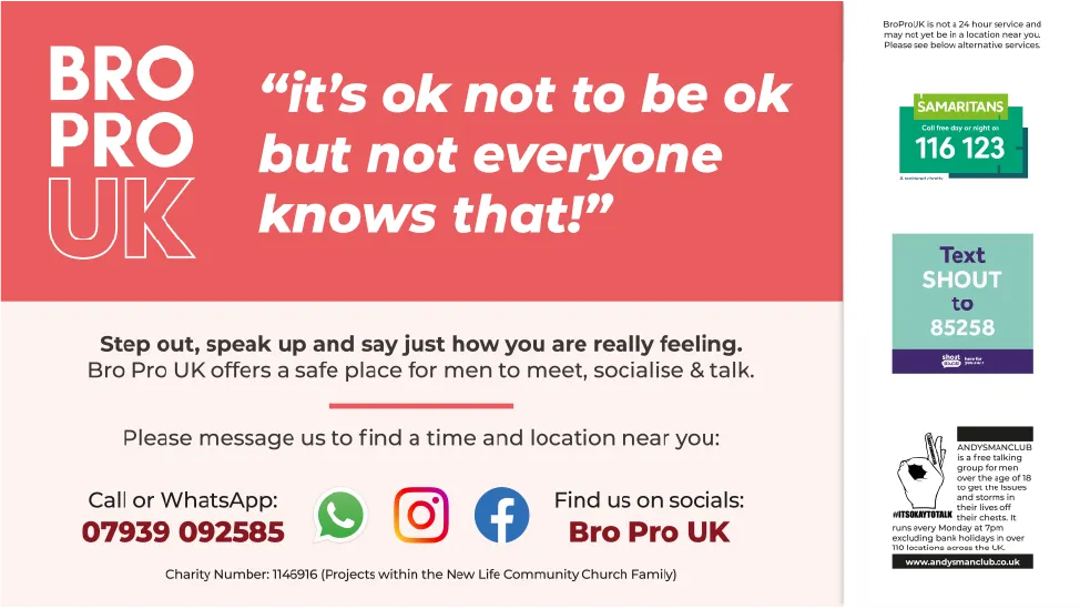
- Banners
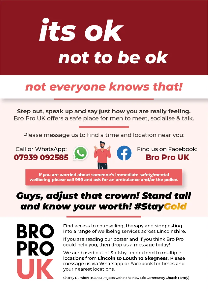
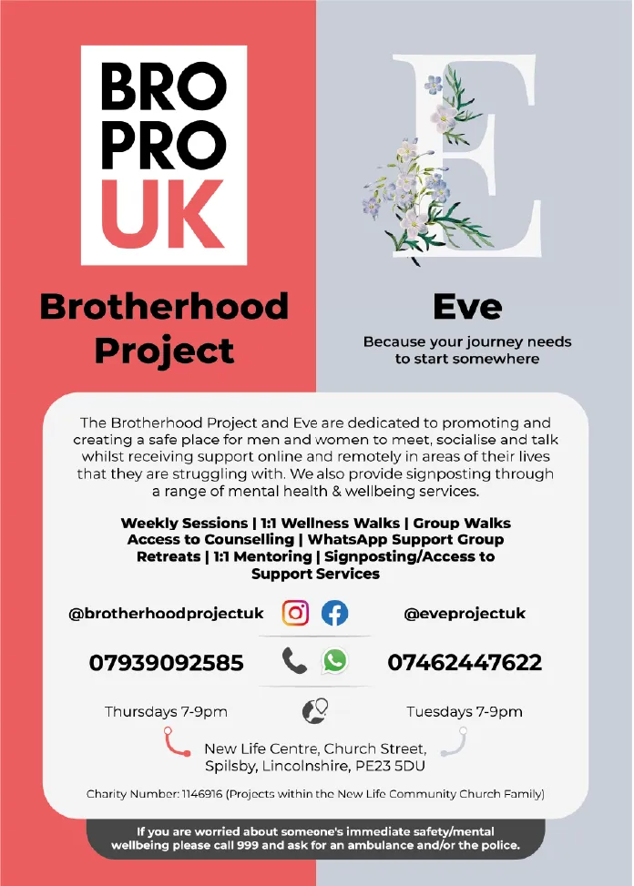
- Flyers
- Posters
- Social media graphics
Each piece was designed to feel consistent, recognisable, and aligned with their message.
This helped them show up more professionally without losing their grassroots authenticity.
3. Designing for Real-World Use
Speed mattered. These materials needed to be produced and shared regularly.
So the focus was on:
- Clear, bold layouts
- Easy-to-read messaging
- Adaptable formats for different channels
This wasn’t about over-designing, it was about making communication effective.
4. Empowering Them with Canva Templates
One of the most important parts of the project was handing over control.
I created Canva versions of key assets so the team could:
- Edit content themselves
- Update event details quickly
- Reuse designs without starting from scratch
This gave them independence and reduced their reliance on external support.
The Outcome
BroProUK now has:
- A logo that works across digital platforms
- A consistent set of brand assets
- Ready-to-use templates for ongoing campaigns
- Greater confidence in how they present themselves
Most importantly, they can continue their work without being bottlenecked by design.
Key Takeaway
Good design isn’t just about how something looks, it’s about how usable it is.
For organisations like BroProUK, the real value comes from creating systems they can sustain themselves.
If you’re running a community-driven project or small organisation, the goal isn’t to have perfect design – it’s to have design that works, consistently, without slowing you down.