Case Study: Building Wellbeing Hub from the Ground Up
Wellbeing Hub wasn’t a redesign project – it was a ground-up build.
Having already supported BroProUK, I was brought in at the very beginning as Wellbeing Hub was being formed. That meant I wasn’t just creating assets. I was helping shape how the organisation would present itself from day one.
This was a step up in scale, ambition, and visibility.
The Challenge
Starting a new organisation brings a different kind of challenge:
- No existing brand or visual identity
- No established design system
- A need to look credible and organised from launch
- Ongoing demand for marketing materials and promotion
Unlike smaller, reactive projects, this required a proactive and structured approach from the outset.
The Strategy
Because I was involved early, the focus was clear:
Build a strong, flexible foundation that could scale with the organisation.
This meant:
- Creating a clear and consistent visual identity
- Developing reusable brand assets
- Supporting ongoing marketing efforts without constant reinvention
The goal wasn’t just to launch – it was to sustain.
The Process
1. Creating the Visual Identity
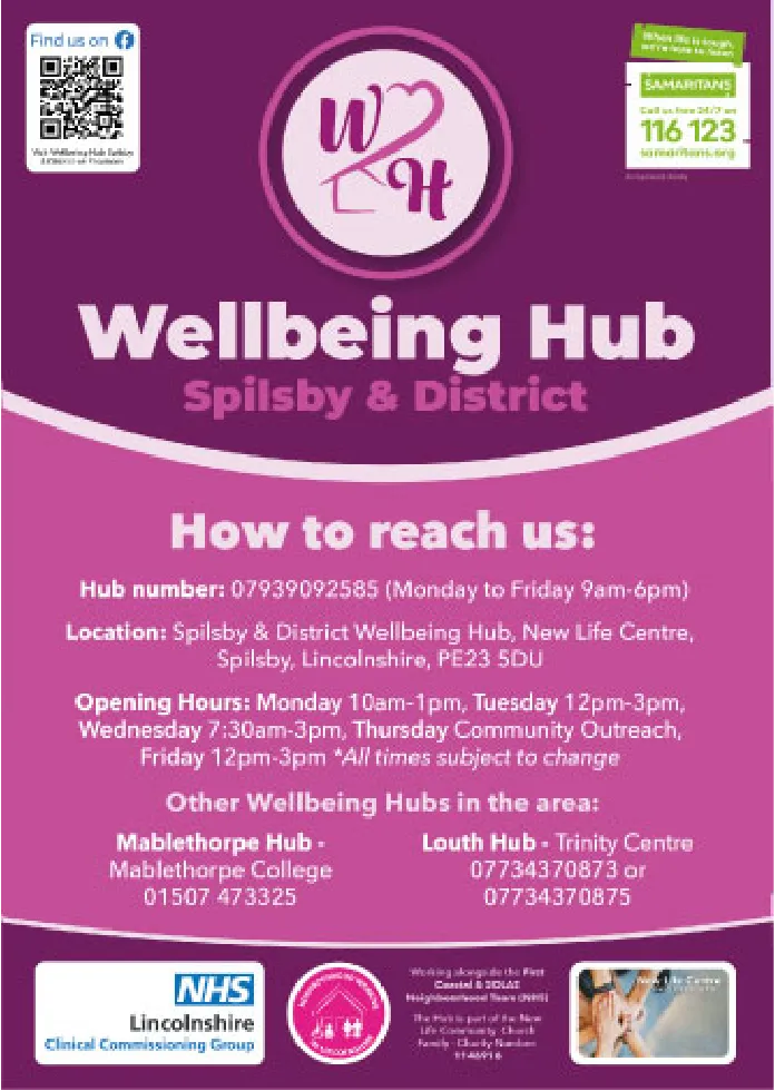
Starting from zero meant defining how Wellbeing Hub should look and feel.
I developed:
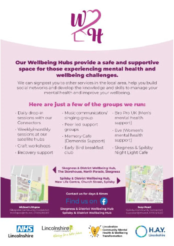
- A cohesive visual style aligned with the organisation’s purpose
- Colour choices and typography that felt approachable yet credible
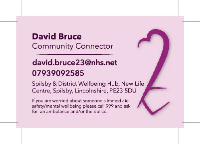
- A consistent direction that could be applied across all materials
This gave the organisation an immediate sense of legitimacy.
2. Building a Library of Brand Assets
To support ongoing activity, I created a range of assets including:
- Social media posts
- Event promotion graphics
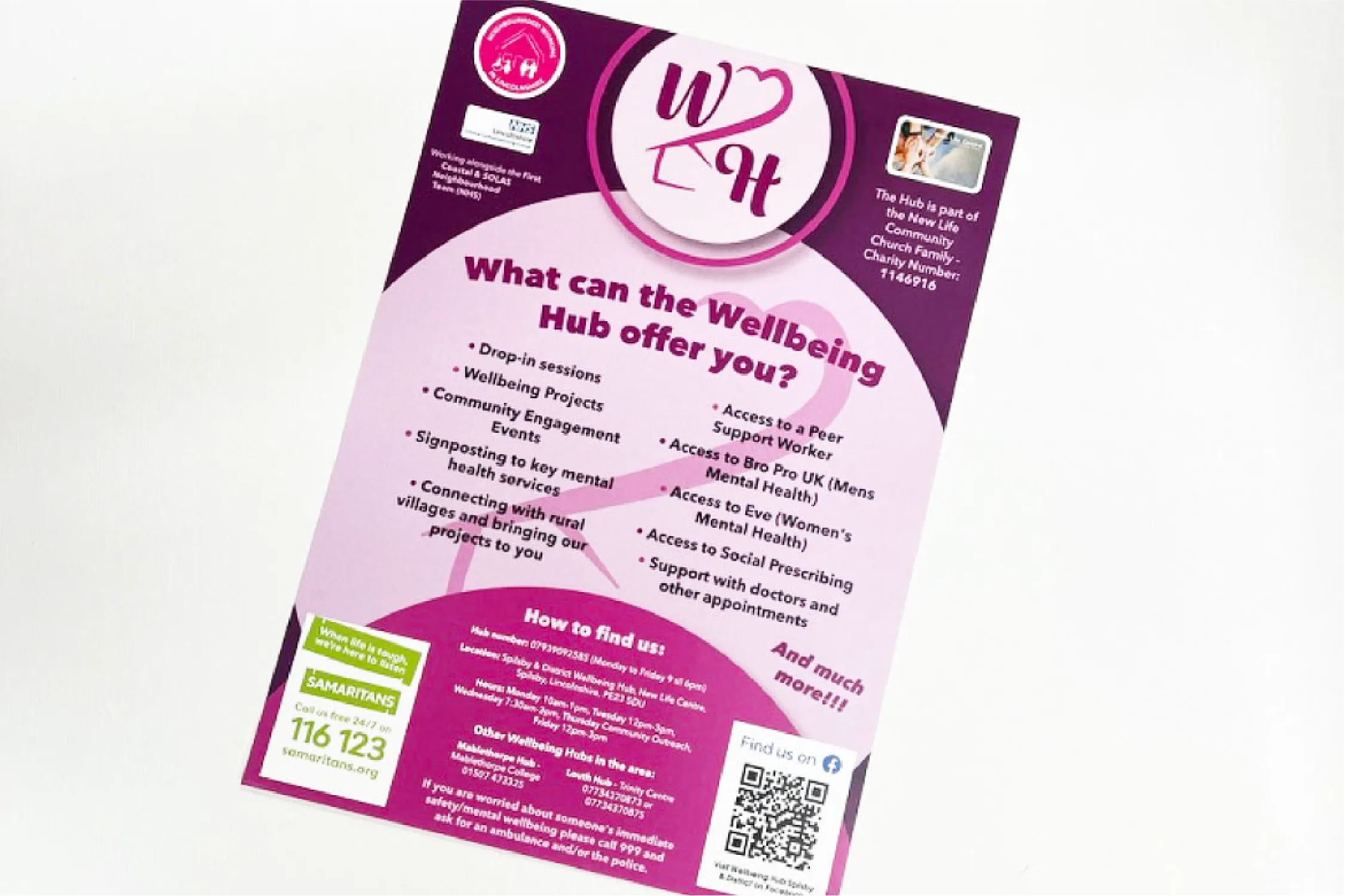
- Flyers and posters
Each asset was designed to be:
- Consistent
- Easy to update
- Recognisable across different channels
3. Supporting Marketing from Day One
Unlike many projects where design comes after strategy, this was integrated from the start.
I worked alongside the organisation to:
- Create promotional materials for events and initiatives
- Ensure visual consistency across campaigns
- Maintain a steady output of content
This helped Wellbeing Hub show up professionally from the very beginning.
4. Designing for Independence
As with BroProUK, it was important that the organisation wasn’t reliant on me for every update.
So I:
- Provided editable templates
- Built systems they could reuse
- Ensured assets were practical, not just polished
This allowed them to move quickly and stay consistent.
The Outcome
Wellbeing Hub launched with:
- A clear and professional visual identity
- A set of marketing-ready assets
- Consistent branding across all touchpoints
- The ability to continue creating and promoting independently
Most importantly, they didn’t look like a new organisation—they looked established from day one.
Key Takeaway
Getting involved early changes everything.
When design is part of the foundation—not an afterthought—it creates clarity, consistency, and momentum from the start.
If you’re starting something new, investing in a solid visual and marketing foundation early on can save you time, money, and confusion later.