Case Study: Shaping the Visual Identity of Good Health Naturally
My work with Good Health Naturally was different from a typical client project.
I wasn’t brought in as an external web designer—I was part of the business. That gave me something far more valuable than a brief: a deep, day-to-day understanding of the brand, its customers, and where it wasn’t quite aligning.
That insight became the foundation for one of the most impactful contributions I made there: a complete evolution of the brand’s visual identity.
The Challenge
Good Health Naturally had an established presence in the natural health space, but visually, there was a disconnect.
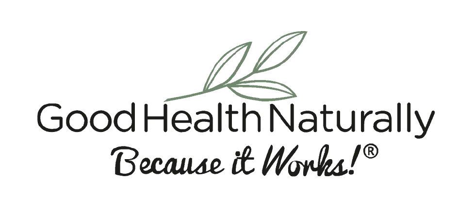
- The existing logo felt overly digital and generic
- It didn’t reflect the “natural” positioning of the brand
- There was an opportunity to create something more distinctive and memorable
- The visual identity lacked cohesion across packaging and digital channels
The brand needed to feel as trustworthy and grounded as the products it was selling.
Old Logo:
The Strategy
Because I was embedded in the business, I wasn’t guessing—I knew the audience.
These were customers who value:
- Natural ingredients
- Trust and credibility
- A sense of tradition and reassurance
So the direction was clear: move away from something that felt synthetic, and towards something that felt timeless, natural, and recognisable.
The Process
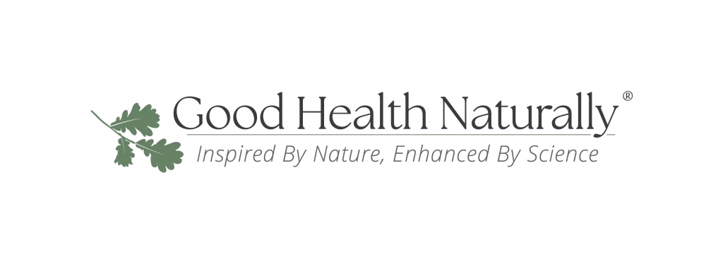
1. Redefining the Logo
The logo became the centrepiece of the transformation.
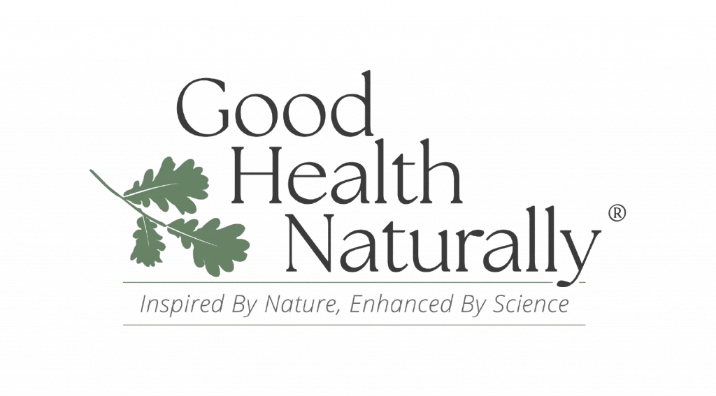
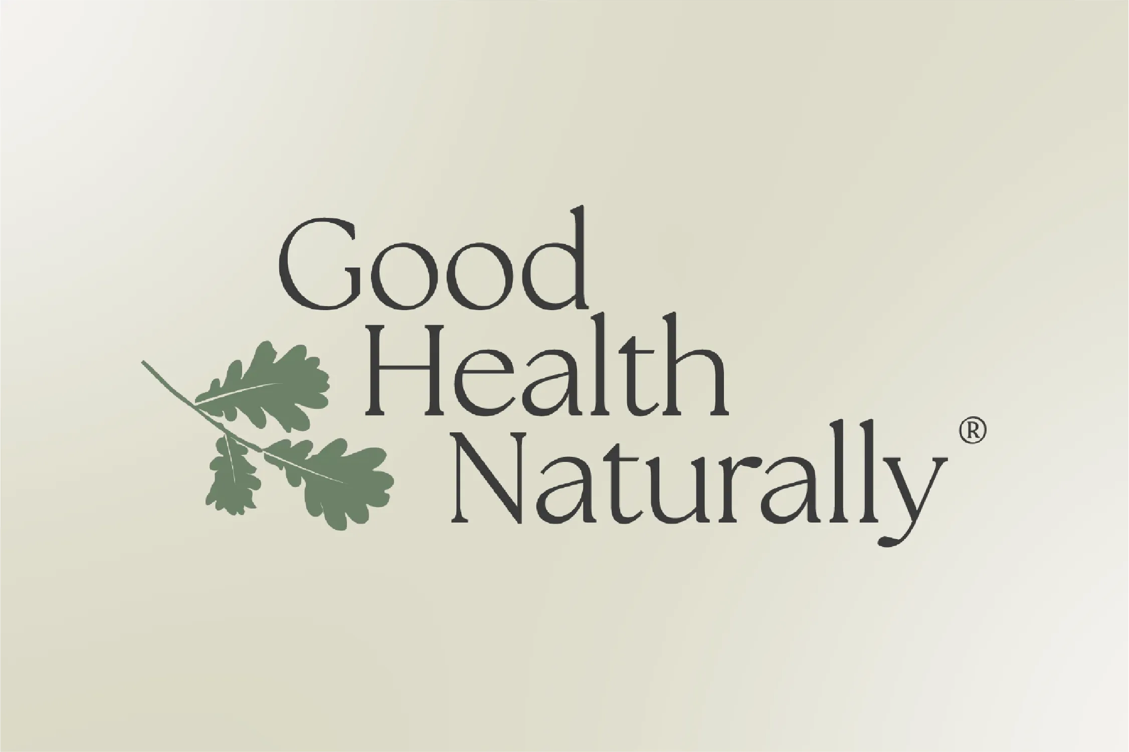
I designed a new identity built around:
- A recognisable oak leaf symbol to represent nature, strength, and longevity
- A classy serif typeface to introduce a sense of trust and heritage
- A simpler, more refined overall mark that could scale across packaging and digital
This wasn’t just a visual update—it was a repositioning of how the brand presents itself.
2. Applying the Identity Across the Business
A logo only works if it’s used consistently.
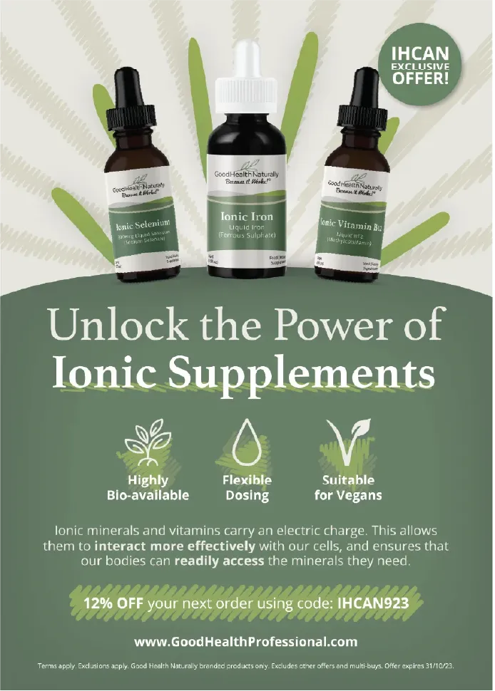
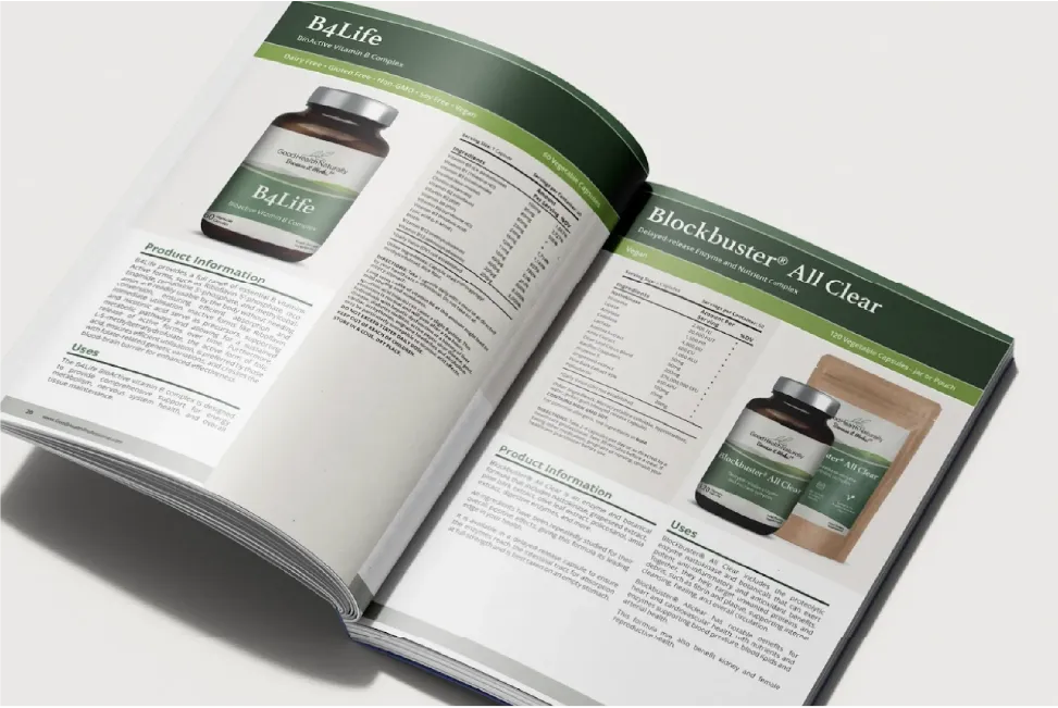
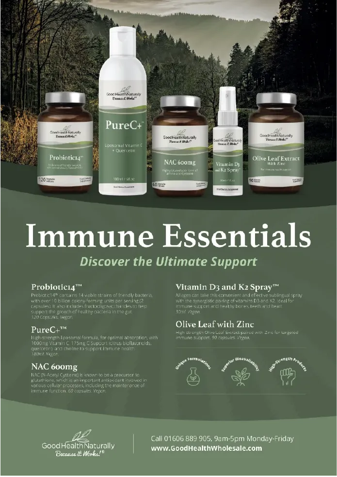
I supported the rollout across:
- Product packaging updates
- Marketing materials
- Digital assets
This ensured the new direction wasn’t just theoretical—it became the new standard.
3. Navigating Supplement Labelling Requirements
Packaging in the supplement industry isn’t just design—it’s regulation-heavy.
I worked through:
- Ingredient and compliance requirements
- Label hierarchy and readability
- Balancing legal constraints with clean, premium design
This is where design meets real-world constraints, and getting it right matters.
4. Supporting Digital & E-commerce
Alongside the brand work, I contributed to the wider digital ecosystem:
- Assisting the website team with imagery and troubleshooting on their WooCommerce store
- Creating visual assets aligned with the new identity
- Helping maintain consistency across the online experience
5. Social Media & Content Creation
I also played a role in shaping how the brand showed up day-to-day:
- Creating content for social media
- Supporting account management
- Ensuring visual consistency across posts
This helped reinforce the new identity beyond just the logo and packaging.
The Outcome
Good Health Naturally now has:
- A distinctive, recognisable logo aligned with its core values
- A more cohesive and premium visual identity
- Packaging that balances compliance with strong design
- Greater consistency across digital and social channels
Most importantly, the brand now looks and feels like what it claims to be: natural, trustworthy, and established.
Key Takeaway
Some of the most valuable design work doesn’t come from the outside—it comes from deeply understanding a business from within.
This project is a strong example of how insight, not just execution, leads to better design decisions.
If your brand feels slightly “off”, even if you can’t immediately explain why, it’s often a sign that your visual identity isn’t fully aligned with your audience.
Fixing that isn’t about decoration. It’s about clarity, positioning, and making sure everything feels right.
Work completed under employment of Good Health Forever Ltd. Copyright is owned by the employer.