
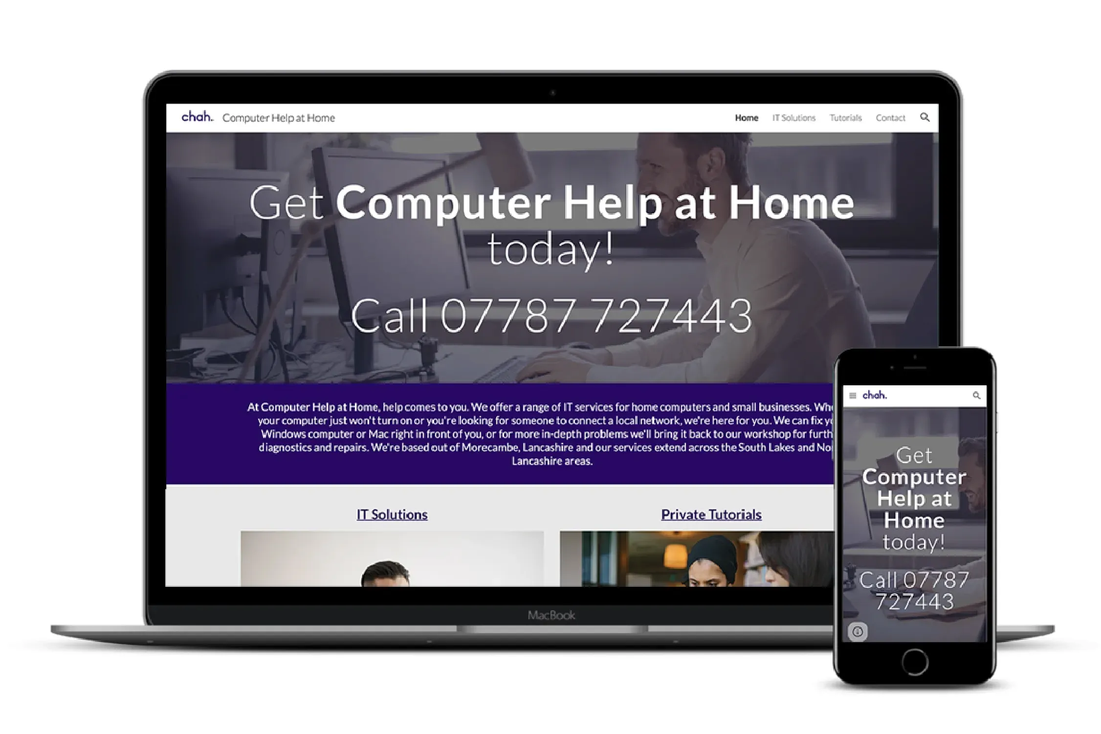
Case Study: Turning Expertise into Enquiries for Computer Help At Home
When Graham from Computer Help At Home came to me, he already had a website he’d built himself using Google Sites.
The problem wasn’t effort, it was effectiveness.
The site clearly showed his knowledge and experience, but it wasn’t converting visitors into enquiries. People could see he knew his stuff, but they weren’t being guided to take action.
This project was about bridging that gap.
The Challenge
The existing website had a few common issues:
- Strong technical knowledge, but weak structure
- Large sections of undirected content
- No clear journey for the user
- Minimal visual engagement
- No logo or defined brand identity
In short: plenty of credibility, but no conversion strategy.
The Strategy
Rather than moving platforms or overcomplicating things, I chose to work within Google Sites and improve what was already there.
The focus was simple:
Make the site easier to understand, more engaging to browse, and clearer in what to do next.
The Process
1. Restructuring for Clarity
The original content wasn’t wrong, it just needed organising.
I broke it down into:
- Clear, scannable sections
- Short, digestible snippets of information
- Defined service areas
This allowed visitors to quickly understand what Graham offers without feeling overwhelmed.
2. Designing Around Calls to Action
One of the biggest gaps was direction.
So I introduced:
- Clear call-to-action sections throughout the site
- Repeated prompts to get in touch
- A more obvious path from “reading” to “enquiring”
Now, the site doesn’t just inform—it guides.
3. Adding Visual Engagement
The original pages felt like blank canvases.
To fix that, I incorporated:
- Carefully selected stock imagery
- More balanced layouts
- Visual breaks between sections
This made the site feel more approachable and professional, without losing its simplicity.
4. Creating a Logo and Identity
Graham didn’t have a logo, which made the brand feel undefined.
I created a simple, clean logo using his chosen purple colour, giving the business:
- A recognisable visual anchor
- Consistency across the site
- A more established feel
It’s a small addition, but it makes a big difference in perception.
The Outcome
Computer Help At Home now has:
- A clearer, more structured website
- Stronger calls to action that encourage enquiries
- A more engaging and visually balanced design
- A simple but effective brand identity
Most importantly, the site now supports Graham’s goal: turning his expertise into actual customer enquiries.
Key Takeaway
Knowledge alone doesn’t convert – presentation and direction do.
This project shows how improving structure, clarity, and visual engagement can unlock the value that’s already there.
If your website is full of useful information but isn’t generating enquiries, the issue usually isn’t what you’re saying—it’s how it’s being presented.